Must Read: What are the key functions of the Analytics Website Performance Overview Tab?
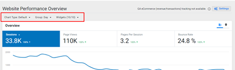
Let’s take you through the UI enhancements that we have made on the Analytics Website Performance. Click on the Analytics tab and then on the ‘Website Performance’ tab and you will immediately see the attractive new layout. Let’s now take a closer look at how you can customize the layout to suit your user experience and the basic functions of the Analytics Website Performance Overview tab. Click on the video, or for an in-depth explanation, scroll through the article.
Click on the ‘settings’ button, and 3 options will appear – Chart Type, Group and Widgets.

Click on Chart type, 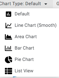 and you will see the options that you can choose from to suit your preference. Default, line chart, area chart, bar chart, pie chart and list view. An important point to note, if you choose a chart type apart from the default setting, it will change only if it is applicable and can display the widget in that particular format. For example, you can use the ’list view’ to view widgets that have metrics with dimensions, such as Traffic by channel, geography, device type widgets. However, the list view will not be applicable for the ’Overview’ and ’Top Events’ widgets and the default widget will be displayed instead of the list view chart.
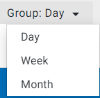
Let’s move on to the next option under ‘settings’, the Group: option. Here, the user can choose to view data for a day, week or month.
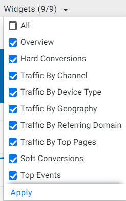
For the widgets option, on the Analytics Dashboard, you can choose to view the metrics of up to 8 widgets. Choose ‘All’ or cherry pick the ones that are most important for you and click on ‘apply’ to view just the widgets that you have chosen.
To start with, revenue data is now fetched from GA eCommerce, and if the data shows 0, then it’s possible that there is problem with the tracking, in such a case, a warning sign will be displayed as you can see next to the settings button.
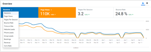
 Next, you can view multiple KPIs in a frame. All that is required is for the user to click on the scorecard tile of the KPI and the performance will be displayed along with the existing KPIs that have been turned on. It now gives your business to make a comparison between KPIs.
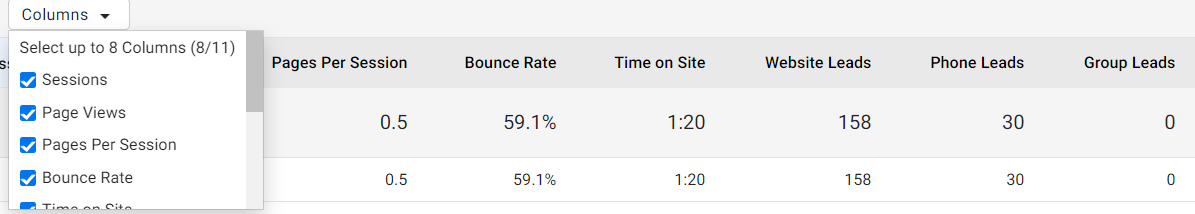
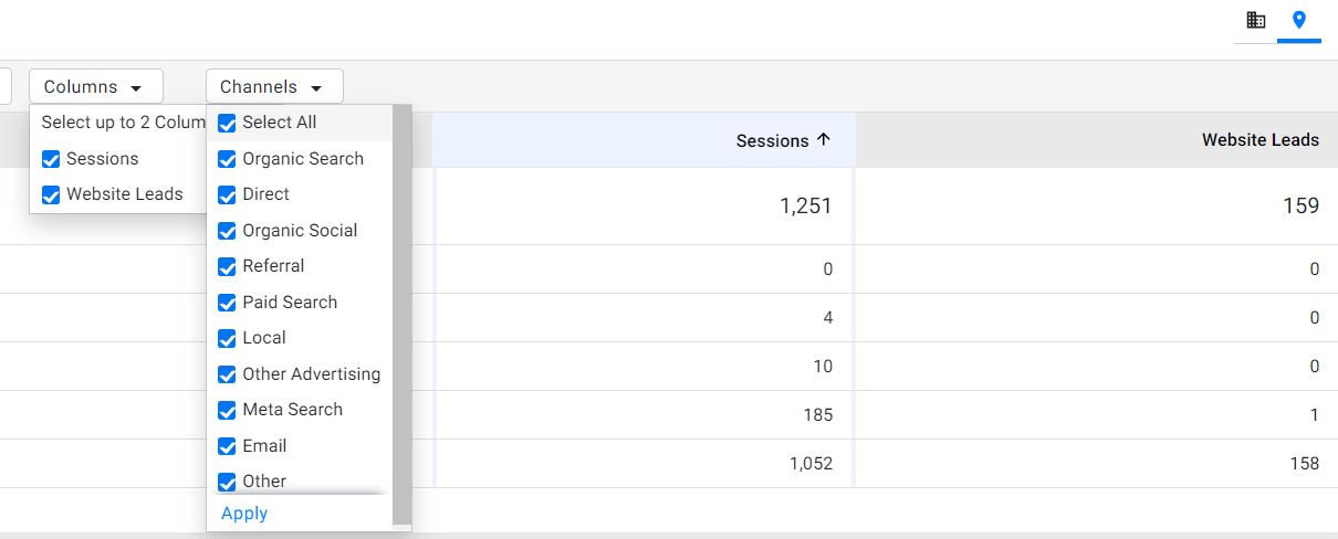
Looking at the top right of the widget, you now have the option of choosing to view an aggregated view (combination of the performance of all profiles) or can choose to view the performance by profiles if you click on the location sign.

Let’s see what you can do by clicking on the location sign to view performance by profile. By clicking on the profile view, you now have the option of choosing columns you wish to see data for based on the metrics listed in the dropdown list. You can choose to view 8 columns at a time.
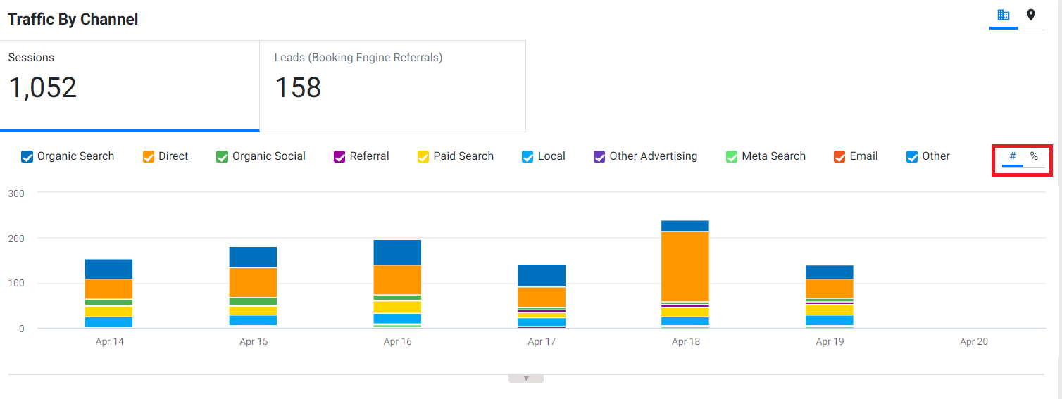
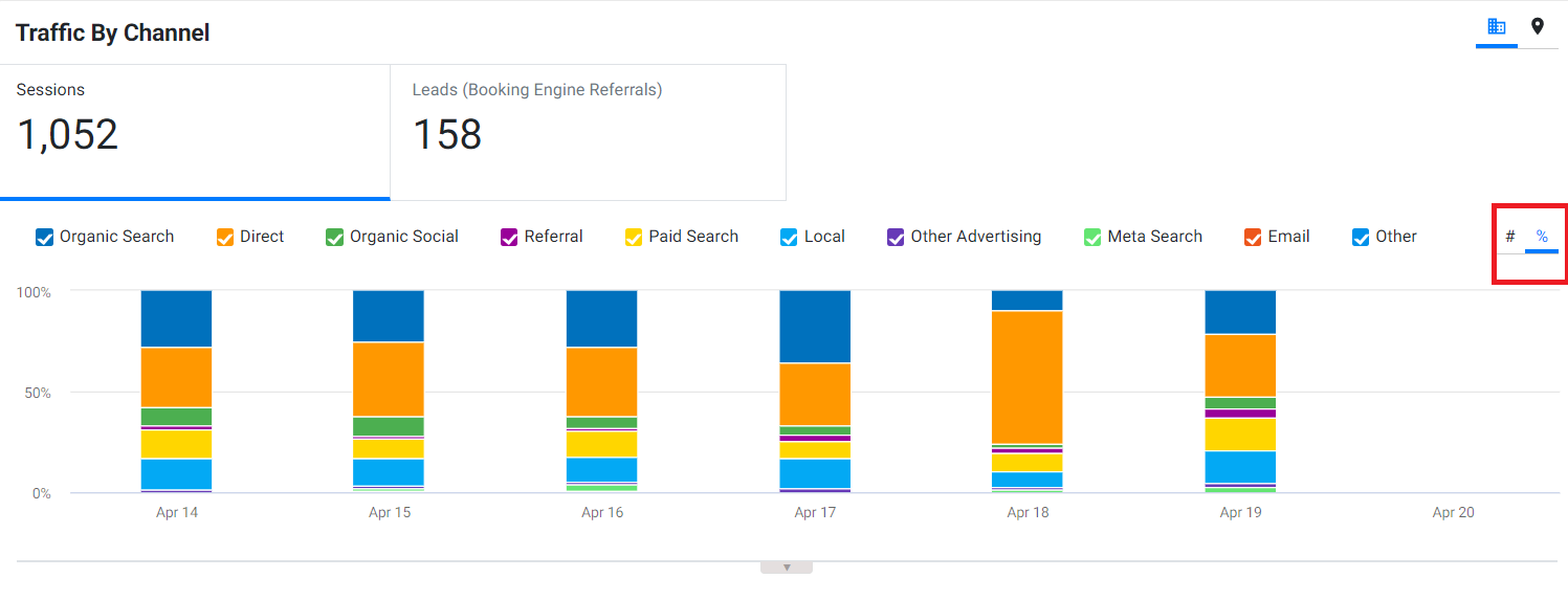
Now, for the widgets Traffic By channel, Traffic by device type, and Traffic by geography, you can choose to see one metric at a time. For example, for the Traffic by Channel widget, you can view either sessions or leads, but not both.
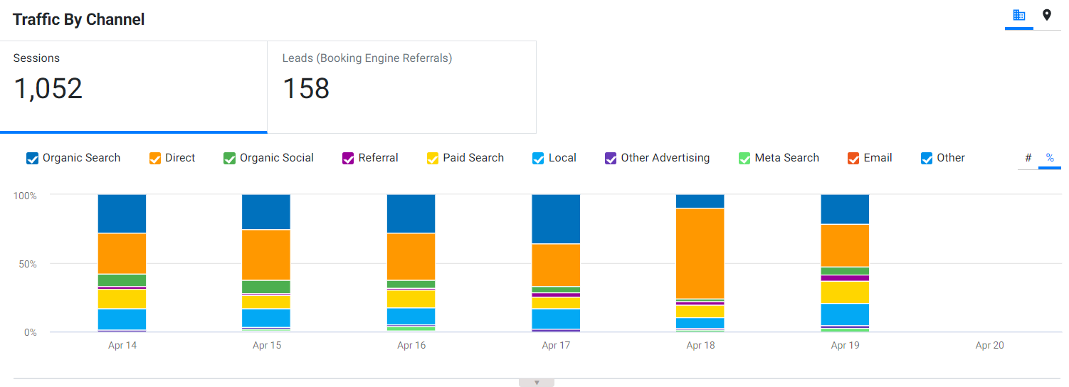
If you are using the Bar Chart to view Traffic By channel, Traffic by device type, and Traffic by geography you also have the option of viewing the performance in numbers or in percentage(out of 100).
If you click on the 'Profile’ view for the Traffic by Channel widget, you have the option of choosing the channels that your business is getting leads and sessions from. Choose either all or particular channels that you wish to track.
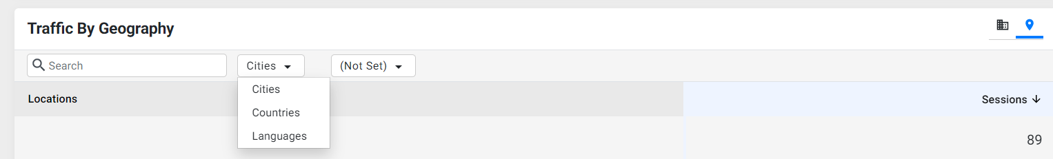
Let’s now look at the cool UI changes for the Traffic by geography widget. If you are viewing the widget in the pie chart, bar chart or line charts, you will see these buttons to view the top 10 or bottom 10 cities, countries and languages that your website is receiving traffic from. The same can be done in the profile view.

In addition, using this option, you can choose a particular city, country and language you are receiving traffic from.